
Poor Sparrow. Google had to buy it and ruin everything. Development basically stopped after the acquisition, aside from "critical bug fixes", of which there were none. This year, they pulled it from the store completely.
But why am I saying "Poor Sparrow"? It's more like "Poor users". They had to suffer because Google wanted superior products for its users. A desktop Gmail client still doesn't exist, unless you count a Chrome Web app as one.

I still have a copy of Sparrow, as do many others. We paid for it, lived it, and often now have been forced to move on as its slowly decayed. It doesn't mean they use it.
Anyway, now that Sparrow is out of the picture permanently, I feel I must start looking for a new Mac email client. I don't like Apple's because the delete keyboard button doesn't archive messages and the interface is too cluttered. I wish .Mail was more than a concept. I would happily pay for it. Other options range from the underdeveloped Unibox to the downright unstable Mailbox. Right now I'm trying out the second version of Airmail, and it's much better than the other options.
Before I move on to the full review, let me quickly say why Mailbox is so terrible. I tried the Mac app when the beta was first released. It had too many bugs and UI glitches, so I gave up. I recently started using it daily for about a week, but gave up again due to random crashes and extreme usability issues like archiving not working until the third try. When I installed Airmail, I had to uninstall Mailbox completely because it wouldn't let Airmail or anything else take over the default email position. Dropbox will have to overhaul the app for me to give it a try again. I'm extremely disappointed with their efforts. It's just another half-hearted Sparrow copy at this point, but it's worse off since it's web-based.
Breath of fresh air the second time around?
The first time I tried Airmail, around two years ago, it felt like a beta. I paid for the app and was disappointed it had such a hard time just starting up. Syncing to the server took forever, and sometimes just stopped. The interface was just annoying to move around in. Overall, I was sad it couldn't replace Sparrow.
I'm glad to say things are looking a bit better in version 2.1. So much so that I want to tell you about my experience.
The second version of Airmail is designed with Yosemite in mind. The icon is an elegant rounded letter flap with an optimistic blue gradient etching, the sidebar is now transparent, and everything is nice and flat. The app now supports many services for sharing large files, from Google Drive and Dropbox to Evernote and even FTP. It's clear that the developers are marketing this app toward more than one type of person. Airmail wants to be the go-to replacement for Mail.app and Sparrow and Outlook and every other email app. There's still some stuff it falls short on, though.
Customization, navigation, innervation
Airmail is by far the most customizable email app there is on any platform. You can customize anything: custom HTML signatures and email body text, custom fonts in the composer window, custom actions for your notifications, custom shortcuts to navigate the interface, custom colors around the interface, and so the list goes on. This makes the learning curve a bit more mountainous than most apps. I had to look up a lot of the features in the documentation, and most of them are still foreign to me after a good amount of use.
Getting around the interface isn't too difficult. Some of the transitions make things a bit slower than Sparrow, which is still surprisingly quick even with 14,000 messages in the Archive. Shortcuts are pretty self-explanatory: j will move to the next message and k will take you to the previous one, Command + R opens the reply window, delete archives the selected message (as opposed to enter in Mailbox, which was just silly), and so on. The inline quick reply view is an outlier, using Command + E as its shortcut (I'm used to `Option + R in Sparrow). There are a ton of others available as well.
My favorite feature in the app is Send and Archive. It's something every modern email app should have. The Inbox One crowd is always pleased by such a feature. I'm still surprised most apps don't incorporate send and archive, especially since most people need to go through a good amount of email each day, making it one keystroke faster.
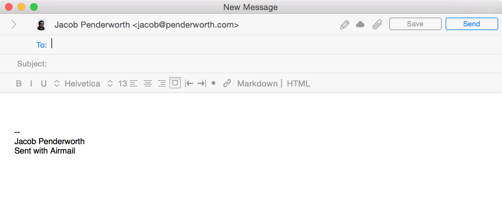
The composing screen is pretty nice. The formatting bar is minimalistic — probably the most basic of anything in the app — and the entire window is focused, which is always welcoming. It is a shame there's no fullscreen composing window available for those really long breakup letters, but the developers likely didn't think high schoolers would be their main user base.
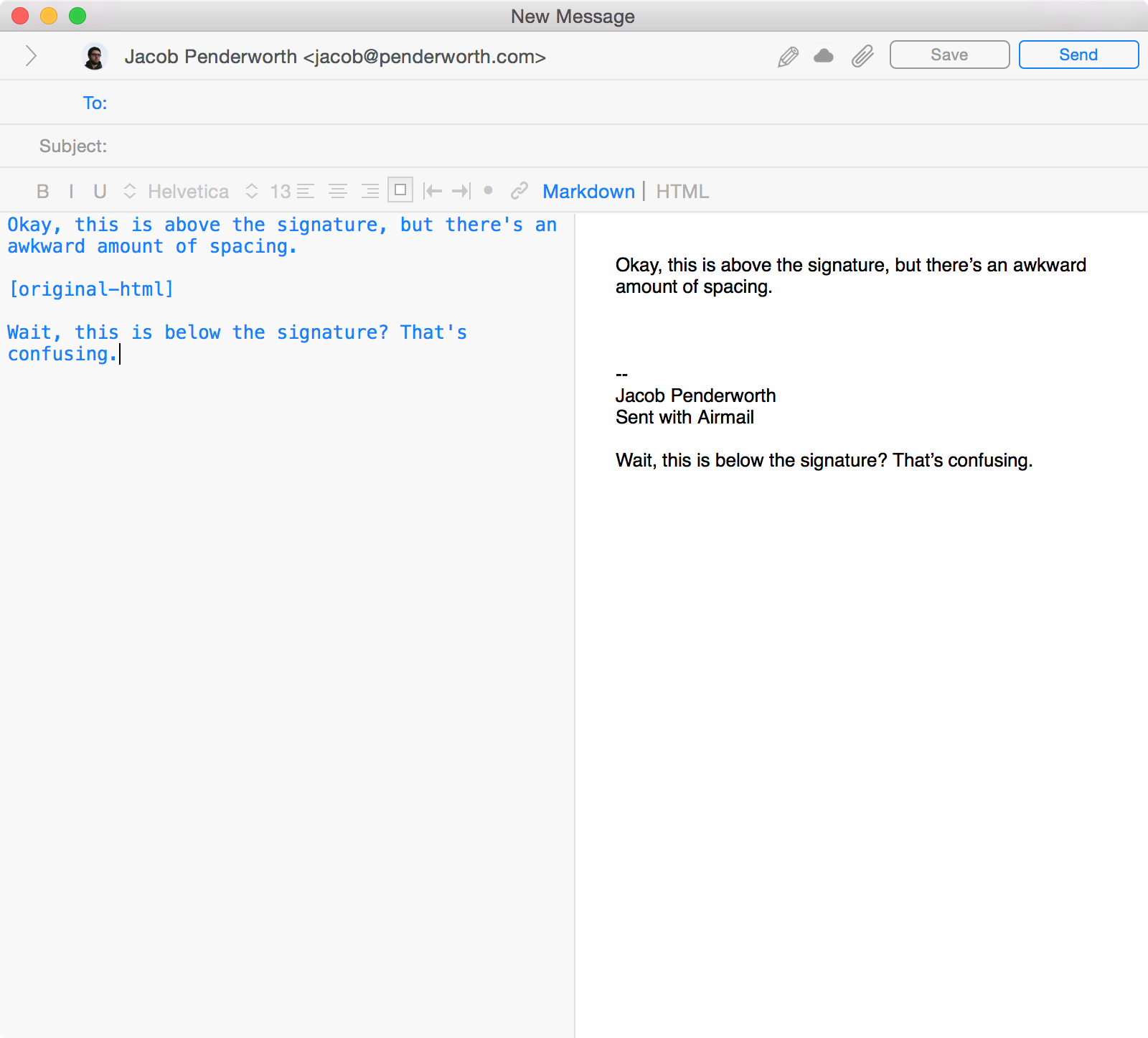
I like the idea of Markdown in an email client, but Airmail doesn't implement it very well. Like the HTML editor, it's a dual-pane system. This means the raw code is written in the left pane and the preview is displayed to the right. That's fine for writing code, but an email is not code. It's an email. I don't know very many people who would that many options while writing an email. Stylistically, emails are best served in plain text. Using HTML to write the email just isn't necessary. It's nice for signatures, but not for composition of multiple paragraphs.
That's where Markdown comes in. Unfortunately, it's just not very good in Airmail. It should be a single-pane hybrid (bold text is bold with the syntax wrapping around it), because anyone writing in Markdown knows what they're doing. A live preview isn't necessary. Also, unlike the HTML editor, content doesn't go two ways. You can't edit the email in Markdown if you've already composed it in rich text or HTML, which is strange.
Daily use
At first, I enjoyed Airmail. It's a new tool for an old task, which means it has the chance to optimize the way I accomplish things. The thing is, I tried every strategy. It flooded with features. It doesn't focus on anything, it just tries to do everything. That makes it unusable in my environment. I just need an email app that does email well, not a bunch of other fancy stuff. Even for people who need some fancy filters and stuff, this app is overkill. It has a decent interface and performs fine, it just isn't usable.
There are too many buttons distracting me, too many view options, too many fonts for my signature, too many ways to search through things. Overall, there's too much to learn, and that's what stops me from using this app.